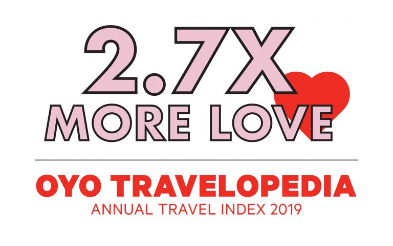
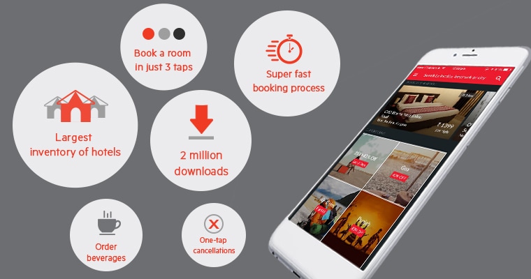
We started working on our mobile app in March and shipped the first version of it on 22nd April, 2015 on the Android Play Store. The iOS version went live on 1st May, 2015 on the App Store. Over the course of the last few months, we have refined it, added more features and have grown to over 2 million downloads in less than 7 months of its launch and a significant share of our business now comes through it.
OYO Rooms came into existence to solve the problem of predictable and affordable stays. We knew that it took a lot of effort to find a good hotel at pocket friendly prices and we wanted to make it easier for consumers to do so. We did it with our offline product – we partner with select hotels, standardize them and make them available at great prices – and we wanted to take it further with our mobile app product. We wanted to build an app that could get the hotel booked in (almost) no time and make it feel effortless.
I will share some of the choices we made with the hope that it can benefit some more people in the product and technology ecosystem. We would love to hear your feedback.
1. Shorten the booking funnel – Our app allows you to make a booking in just 3 taps (if you want to book a hotel near you) including the tap to open the app and cuts down on the booking steps and time over other hotel booking apps. We laid down an interesting internal target of 50% of the new users to cancel the booking immediately after making one – the booking flow had to be this seamless that people don’t realize they just made a hotel reservation. When we released this to the customers, we got some customers who were pleasantly surprised by it and some who got shocked by it and panicked when they saw they had made a booking while just playing around with the app. We took this feedback and added a little delay in the booking creation process and prepared the customer for what was to happen next through some subtle animation and provided a way to cancel the next step if they chose to.
2. Mandatory Sign-up/Sign-in – This one was the most controversial choices. Conventional wisdom told us to remove any steps that came in letting a customer explore the app and browse the hotels. However, we wanted to separate the sign-up, data entry and user authentication steps from the booking flow to retain the seamlessness of the booking experience, even for the first time booker. To mitigate the impact, we tried to make the sign-up process simpler by eliminating the need of a password and using One Time Password (OTP) as the authentication mechanism. We ran some exciting offers for our first time users of the app and made sure that we didn’t lose many customers from the top of the funnel. It is important to look at this approach with respect to the context of your business. Ours is a transactional heavy business where most customers download our app when they have a need to book a hotel. If you are building a game or a utility app, the same approach may not work as well there.
3. Payment to be done post booking – This was a deviation from the norm again. Most sites/apps (including our own web app) fork the payment step into two and ask for a choice between paying now and paying at the hotel. The drop-offs at the payment step on the mobile form factor are quite high in India (given our internet speeds and the second factor authentication for payments). We decided to make this into a linear flow by first creating a confirmed booking for the customer and then providing an optional step to make a payment.
4. Dynamic Home Page – Our home screen is not a booking widget and we don’t presume every time you open the app, you are there to make a booking with us, especially when you already have a booking with us. We believe it is our karma to help our customers to get a better stay experience and we want to support them at all steps – booking a cab, finding nearby restaurants, ordering room service, etc. Our app’s home page is a cards based layout where you can see your bookings and get some quick action buttons (relevant to your booking state) along with options to search and the nearest OYOs shown upfront without the need to a search.
We have tried to innovate with some purpose and made some choices that may not please everyone, but at the same time gets a lot of customers to love us and differentiate ourselves from others. We believe in continuous experimentation and improvement and we know there’s lot more to do. I am proud of the young team that has worked on our app and gotten it till here and am equally excited about the work that is underway to make the booking and stay experience of our customers even more seamless.